Considering contemporary graffiti artist Retna.

The first time I saw the acclaimed graffiti artist Retna’s work was at an annual Atlanta art party and fundraiser hosted at the home of a local collector. The party was in conjunction with MOCA Museum of Contemporary Art Gala. The moment I stepped through the front door which was the art that greeted you. My first initial thought was, “I wonder what the fancy script means”. I thought it was Arabic lettering and language. It turns out it’s his own distinctive lettering that is derived from Blackletter, Egyptian Hieroglyphics, Arabic, and Hebrew calligraphy, as well as more traditional types of street-based graffiti.
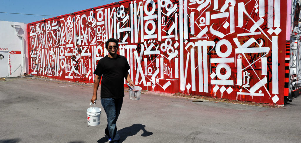
Photo: Wynwood Walls Los Angeles, CA
I later learned his name on Instagram when Usher (Raymond) posted his work, who is also one of his earliest fans. Little did I know that Retna was a moniker he took on that he borrowed from a Wu-Tang lyric “I burn the holes through retina” His real name is Marques Lewis.
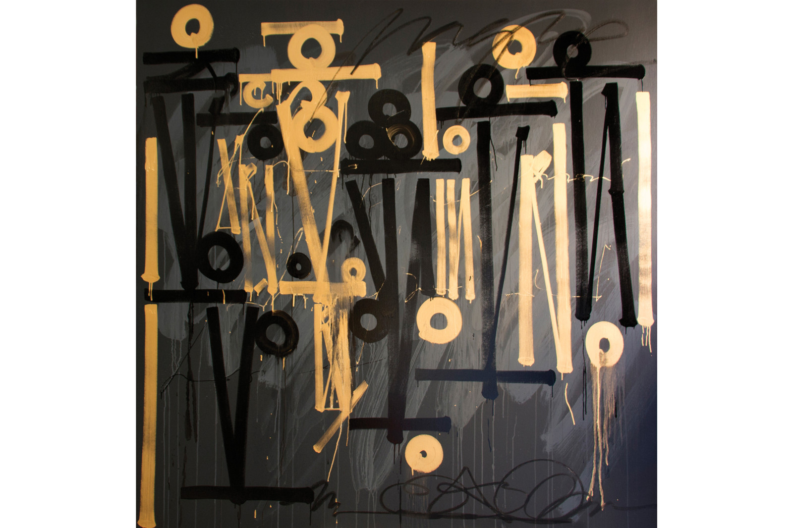
Photo: Maddox Gallery London
At an early age, Retna was introduced to L.A.’s mural culture. While still in high school, he led one of the largest and most innovative graffiti art collectives the city has witnessed. Retna has done advertising work for brands such as Vista Jet, Louis Vuitton, and Nike. His artwork also adorns the cover of Justin Beiber’s Purpose album that debuted in 2015.
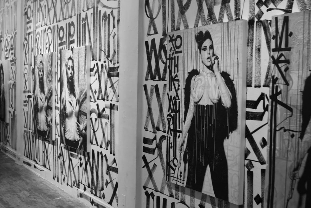
He is perhaps best known for appropriating fashion advertisements and amplifying them with his own text and language. As seen here.
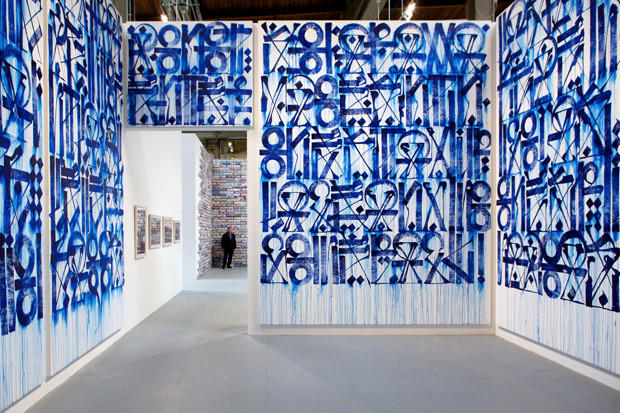
Photo: MOCA art in the streets
What I’ve loved is also the way he uses color and his main medium which is acrylic paint or spray can. You will usually see these letters in metallic or dusted with a shimmering iridescence.
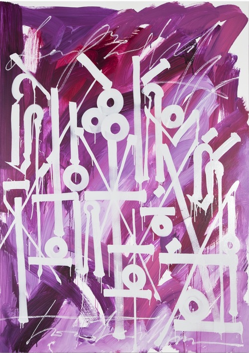
Photo: New Image Art
Much of his work incorporates fine art and graffiti, between power and opposition, and tradition and advancement. He lives and works in Los Angles, California. See more or contact his studio here.
I’ll be posting here about twice a month about contemporary art and design. Sign up so you don’t miss out on what I’m loving and discovering. ♥


4 Responses
Thank you for introducing me to this artist’s work~ I really enjoyed reading about it and appreciate how he is using lettering in such a unique and creative way!
It’s so interesting…I was really taken aback when I first saw it….some artist will really have you thinking.
Thank you for introducing us to this wonderful artist!
Sheri, I really appreciate you checking out this post. I just had to share…
Comments are closed.